Tuesday, March 26, 2013

Business App IT Lab - Session 10


Assignment 1


Create 3 vectors, x, y, z and choose any random values for them, ensuring they are of equal length, bind them together.Create 3 dimensional plots of the same.

Solution:

First creating a random data set of 50 items with mean =30 and standard deviation =10

> data <- rnorm(50,mean=30,sd=10)
> data

Taking sample data of length 10 from the created data set in three different vectors x,y,z
> x <- sample(data,10)
> x

> y <- sample(data,10)
> y

> z <- sample(data,10)
> z

Binding the three vectors x,y,z into a vector T using cbind
> T <- cbind(x,y,z)
> T


Plotting 3d graph 

Command:

> plot3d(T[,1:3])


Plotting of graph with labels for axes and color

Command 
> plot3d(T[,1:3], xlab="X Axis" , ylab="Y Axis" , zlab="Z Axis", col=rainbow(500))


Plotting of graph with labels for axes, color and type = spheres

Command
> plot3d(T[,1:3], xlab="X Axis" , ylab="Y Axis" , zlab="Z Axis", col=rainbow(5000), type='s')


Plotting of graph with labels for axes, color and type = points

Command

> plot3d(T[,1:3], xlab="X Axis" , ylab="Y Axis" , zlab="Z Axis", col=rainbow(5000), type='p')


Plotting of graph with labels for axes, color and type = lines

Command

> plot3d(T[,1:3], xlab="X Axis" , ylab="Y Axis" , zlab="Z Axis", col=rainbow(5000), type='l')


Assignment 2

Choose 2 random variables 
Create 3 plots: 
1. X-Y 
2. X-Y|Z (introducing a variable z and cbind it to z and y with 5 diff categories)
3. Color code and draw the graph 
4. Smooth and best fit line for the curve

Solution

Creating a data set for two random variables and then introducing third variable z

Command:

> x <- rnorm(5000, mean= 20 , sd=10)
> y <- rnorm(5000, mean= 10, sd=10)
> z1 <- sample(letters, 5)
> z2 <- sample(z1, 5000, replace=TRUE)
> z <- as.factor(z2)
> z


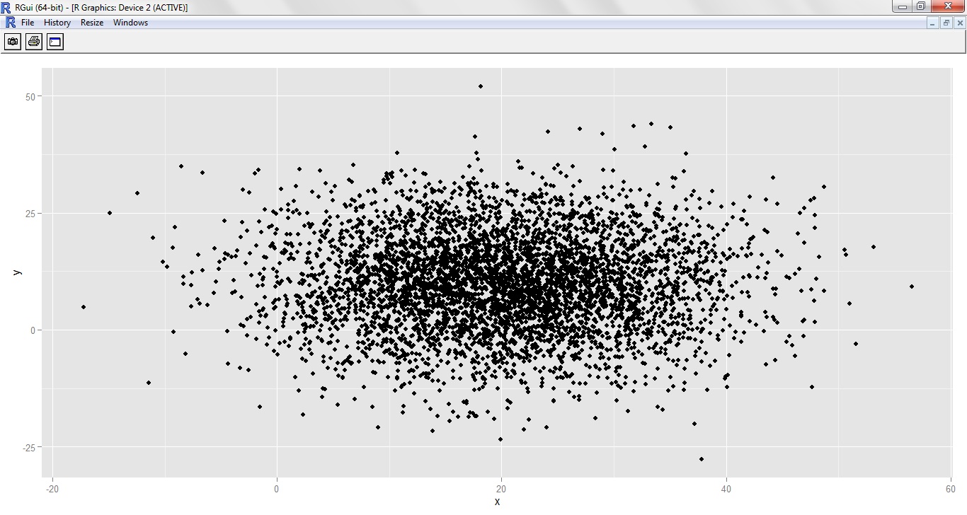
Creating Quick Plots

Command:

>qplot(x,y)


>qplot(x,z)


For semi-transparent plot

> qplot(x,z, alpha=I(2/10))


For coloured plot

> qplot(x,y, color=z)


For Logarithmic coloured plot

> qplot(log(x),log(y), color=z)


Best Fit and Smooth curve using "geom"

Command:

> qplot(x,y,geom=c("path","smooth"))


> qplot(x,y,geom=c("point","smooth"))


> qplot(x,y,geom=c("boxplot","jitter"))


Saturday, March 23, 2013

Business App IT Lab - Session 9

Assignment

Tools that can be used for a variety of data visualisation tasks

We will look at couple of tools developed to collate and analyse from Google Drive.
The google docs are the need of the hour and managing them is not a comfortable job for a manager. 
Several free apps are available which help them scrutinize.

FreeDive

What it does: This alpha project from the Knight Digital Media Center at UC Berkeley turns a Google Docs spreadsheet into an interactive, sortable database that can be posted on the Web.

Benefits: In addition to text searching, you can include numerical range-based sliders. Usage is free. End users can easily create their own databases from spreadsheets without writing code.


FreeDive's chief current attraction is the ability to create databases without programming; however, freeDive source code will be posted and available for use once the project is more mature. That could appeal to IT departments seeking a way to offer this type of service in-house, allowing end users to turn a Google Doc into a filterable, sortable Web database using the Google Visualization API, Google Query Language, JavaScript and jQuery -- without needing to manually generate that code.

Drawbacks: My test application ran into some intermittent problems; for example, it wouldn't display my data list when using the "show all records" button. This is an alpha project, and should be treated as such.

In addition, the current iteration limits spreadsheets to 10 columns and a single sheet. One column must have numbers, so this won't work for text-only information. The search widget is currently limited to a few specific choices of fields to search, although this might increase as the project matures. (A paid service like Caspio would offer more customization.) The nine-step wizard might get cumbersome after frequent use.


Explore your results

Instructions: Use the filter(s) below to customize your search results. Use the tool above to perform a new search.
Fetching data... Thank you for waiting.
Searches with a large number of results may take longer to load.

FreeDive's chief current attraction is the ability to create databases without programming; however, freeDive source code will be posted and available for use once the project is more mature. That could appeal to IT departments seeking a way to offer this type of service in-house, allowing end users to turn a Google Doc into a filterable, sortable Web database using the Google Visualization API, Google Query Language, JavaScript and jQuery -- without needing to manually generate that code.

Drawbacks: My test application ran into some intermittent problems; for example, it wouldn't display my data list when using the "show all records" button. This is an alpha project, and should be treated as such.

In addition, the current iteration limits spreadsheets to 10 columns and a single sheet. One column must have numbers, so this won't work for text-only information. The search widget is currently limited to a few specific choices of fields to search, although this might increase as the project matures. (A paid service like Caspio would offer more customization.) The nine-step wizard might get cumbersome after frequent use.


Friday, March 15, 2013

Business App IT Lab - Session 8


Assignment

We will be doing Panel Data Analysis of "Produc" data

We will be analysing on three types of model :
      Pooled affect model
      Fixed affect model
      Random affect model 

Then we will be determining which model is the best by using functions:
       pFtest : for determining between fixed and pooled
       plmtest : for determining between pooled and random
       phtest: for determining between random and fixed

Commands:

Loading data: 
> data(Produc , package ="plm")
> head(Produc)

 Data

Pooled Effect Model 

> pool <- plm(log(pcap)~ log(hwy) + log(water) + log(util) + log(pc) + log(gsp) + log(emp) + log(unemp) , data =Produc, model=("pooling"), index = c("state","year"))
> summary(pool)


 Pooled Effect Model


Fixed Affect Model:

> fixed <- plm(log(pcap)~ log(hwy) + log(water) + log(util) + log(pc) + log(gsp) + log(emp) + log(unemp) , data =Produc, model=("within"), index = c("state","year"))
> summary(fixed)


Fixed Effect Model

Random Effect Model:
> random <- plm(log(pcap)~ log(hwy) + log(water) + log(util) + log(pc) + log(gsp) + log(emp) + log(unemp) , data =Produc, model=("random"), index = c("state","year"))
> summary(random)


Random Effect Model

Comparison


The comparison between the models would be a Hypothesis testing based on the following concept:

H0: Null Hypothesis: the individual index and time based params are all zero
H1: Alternate Hypothesis: atleast one of the index and time based params is non zero

Pooled vs Fixed

Null Hypothesis: Pooled Effect Model
Alternate Hypothesis : Fixed Effect Model

Command:
> pFtest(fixed,pool)
Result:

data:  log(pcap) ~ log(hwy) + log(water) + log(util) + log(pc) + log(gsp) +      log(emp) + log(unemp)
F = 56.6361, df1 = 47, df2 = 761, p-value < 2.2e-16
alternative hypothesis: significant effects
Since the p value is negligible so we reject the Null Hypothesis and hence Alternate hypothesis is accepted which is to accept Fixed Effect Model.

pFtest


Pooled vs Random

Null Hypothesis: Pooled Affect Model
Alternate Hypothesis: Random Affect Model

Command :
> plmtest(pool)

Result:

        Lagrange Multiplier Test - (Honda)
data:  log(pcap) ~ log(hwy) + log(water) + log(util) + log(pc) + log(gsp) +      log(emp) + log(unemp)
normal = 57.1686, p-value < 2.2e-16
alternative hypothesis: significant effects

Since the p value is negligible so we reject the Null Hypothesis and hence Alternate hypothesis is accepted which is to accept Random Effect Model.

plmtest

Random vs Fixed

Null Hypothesis: No Correlation . Random Affect Model
Alternate Hypothesis: Fixed Affect Model

Command:
 > phtest(fixed,random)

Result:

        Hausman Test
data:  log(pcap) ~ log(hwy) + log(water) + log(util) + log(pc) + log(gsp) +      log(emp) + log(unemp)
chisq = 93.546, df = 7, p-value < 2.2e-16
alternative hypothesis: one model is inconsistent

Since the p value is negligible so we reject the Null Hypothesis and hence Alternate hypothesis is accepted which is to accept Fixed Effect Model.

phtest


Conclusion: 

So after making all the comparisons we come to the conclusion that Fixed Effect Model is best suited to do the panel data analysis for "Produc" data set.

Hence , we conclude that within the same id i.e. within same "state" there is no variation.


Wednesday, February 13, 2013

Business App IT Lab - Session 6


Assignment 1
Create log returns data and calculate historical volatility


Data Set: NSE Nifty Indices Data from 1st Jan 2012 to 31st Jan 2013
Working Column : Closing Price named Close
Formula Used: (logSt - logS(t-1))/logS(t-1)

Commands:
> stockprice <- read.csv(file.choose(),header=T)
> closingprice <- stockprice$Close
> closingprice.ts <- ts(closingprice , frequency=252)
> log.returns1 <- log(closingprice.ts , base=exp(1)) - log(lag(closingprice.ts,k=-1), base = exp(1))
> log.returns <- log.returns1/log(lag(closingprice.ts,k=-1), base = exp(1))
> log.returns
> T = (252)^0.5
> historical.volatility <- sd(log.returns) *T
> historical.volatility


Assignment 2:
 Create acf plot and interpret the result for log returns data and do ADF test and interpret it. 


Command:
> acf(log.returns)

Graph Interpretation: The two dotted lines represent the confidence interval of 95%. This is a visual tool to interpret the stationarity of time series. Autocorrelation calculates the correlation between different time steps/lags within the same variable. Since the correlation measurements lie within the confidence interval and there is apparent pattern in the correlation we can say that time series is stationary. 


Augmented Dickey-Fuller(ADF) Test

Command:
>adf.test(log.returns)

Interpretation: Since the p value obtained in ADF test is 0.01 which is less than alpha . The default value of alpha is 0.05. So we are going to reject the null hypothesis and accept the alternate hypothesis. Here the alternate hypothesis is that the time series is stationary. Hence by looking at p value we can say that time series is stationary.


Thursday, February 7, 2013

Business App IT Lab - Session 5


Returns and Forecasting


Objective 1 : Find returns of NSE data > 6 months.having selected the 10th data as start and 95th data point as end.Also plot the assignment .

Solution:

Step 1: Read data  in the form of CSV file for the period 1/12/2011 to 5/02/2013
Command:
 z<-read.csv(file.choose(),header=T)

Step 2: Choose the Close column.
Command:
 close<-z$Close

Step 3: Vectorised the data i.e form a matrix of order 1X298 as 298 data points are available in close.
Command:
dim(close)<-c(1,298)

Step 4: Create time-series objects for close data from element (1,10 to1,95)
Command:
close.ts<-ts(close[1,10:95],deltat=1/252)

Step 5: Calculate difference between preceding and succeeding value
Command:
close.diff<-diff(close.ts)

Step 6: Calculate return :
Command:
return<-close.diff/lag(close.ts,k=-1)
final<-cbind(close.ts,close.diff,return)

Step 7: Plot
Command:
plot(return,main="Return from 10th to 95th")
plot(final,main="Data from 10th to 95, Difference, Return")


Objective 2: 1-700 data is available, Predict the data from 701-850, use the GLM estimation using LOGIT Analysis for the same

Solution:

Step 1: Read data  in the form of CSV file

Command:
z<-read.csv(file.choose(),header=T)

Step 2: Check the dimension of z
Command
dim(z)


Step 3: Choose 1-700 data
Command

 new<-z[1:700,1:9]

Step 4:
Command
head(new)

Step 5:
Identify the factor and run the Logit regression 
Command

 new$ed <- factor(new$ed)
 new.est<-glm(default ~ age + ed + employ + address + income, data=new, family ="binomial")
 summary(new.est)

Step 6:
Prediction<-z[701:850,1:8]
 Prediction$ed<-factor(Prediction$ed)
 Prediction$prob<-predict(new.est, newdata =Prediction, type = "response")
 head(Prediction)


Tuesday, January 22, 2013

Business App IT Lab - Session 3

Assignment 1a


Fit ‘lm’ and comment on the applicability of ‘lm’
Plot1: Residual vs Independent curve
Plot2: Standard Residual vs independent curve

Solution


> file<-read.csv(file.choose(),header=T)
> file
  mileage groove
1       0 394.33
2       4 329.50
3       8 291.00
4      12 255.17
5      16 229.33
6      20 204.83
7      24 179.00
8      28 163.83
9      32 150.33
> x<-file$groove
> x
[1] 394.33 329.50 291.00 255.17 229.33 204.83 179.00 163.83 150.33
> y<-file$mileage
> y
[1]  0  4  8 12 16 20 24 28 32
> reg1<-lm(y~x)
> res<-resid(reg1)
> res
         1          2          3          4          5          6          7          8          9
 3.6502499 -0.8322206 -1.8696280 -2.5576878 -1.9386386 -1.1442614 -0.5239038  1.4912269  3.7248633
> plot(x,res)

As the plot is parabolic, so we will not be able to do regression.


Assignment 1b - Alpha-Pluto Data


Fit ‘lm’ and comment on the applicability of ‘lm’
Plot1: Residual vs Independent curve
Plot2: Standard Residual vs independent curve

Also do:
Qq plot
Qqline

Solution


> file<-read.csv(file.choose(),header=T)
> file
   alpha pluto
1  0.150    20
2  0.004     0
3  0.069    10
4  0.030     5
5  0.011     0
6  0.004     0
7  0.041     5
8  0.109    20
9  0.068    10
10 0.009     0
11 0.009     0
12 0.048    10
13 0.006     0
14 0.083    20
15 0.037     5
16 0.039     5
17 0.132    20
18 0.004     0
19 0.006     0
20 0.059    10
21 0.051    10
22 0.002     0
23 0.049     5
> x<-file$alpha
> y<-file$pluto
> x
 [1] 0.150 0.004 0.069 0.030 0.011 0.004 0.041 0.109 0.068 0.009 0.009 0.048
[13] 0.006 0.083 0.037 0.039 0.132 0.004 0.006 0.059 0.051 0.002 0.049
> y
 [1] 20  0 10  5  0  0  5 20 10  0  0 10  0 20  5  5 20  0  0 10 10  0  5
> reg1<-lm(y~x)
> res<-resid(reg1)
> res
         1          2          3          4          5          6          7
-4.2173758 -0.0643108 -0.8173877  0.6344584 -1.2223345 -0.0643108 -1.1852930
         8          9         10         11         12         13         14
 2.5653342 -0.6519557 -0.8914706 -0.8914706  2.6566833 -0.3951747  6.8665650
        15         16         17         18         19         20         21
-0.5235652 -0.8544291 -1.2396007 -0.0643108 -0.3951747  0.8369318  2.1603874
        22         23
 0.2665531 -2.5087486
> plot(x,res)

> qqnorm(res)


> qqline(res)

Assignment 2

Justify Null Hypothesis using ANOVA

Solution


As indicated in the below screenshot


As the p-value is 0.687( >5%), we accept the null hypothesis.

Tuesday, January 15, 2013

Business App IT Lab - Session 2


Assignment 1

To bind columns/rows from 2 different matrices into a new matrix


Solution

As indicated in the screenshot below


Assignment 2

Multiply two matrices

Solution

As indicated in the below screenshot


Assignment 3

To read NSE historical data dated from 1st Dec, 2012 to 31st Dec, 2012 from a .csv file.
To find regression between the High Price and the opening share price and also calculating the 
residuals.

Solution

Commands as indicated in the below screenshot


Residuals


 Plot

Assignment 4

To generate data for a normal distribution and plot the distribution curve

Solution

To generate normally distributed random numbers function used is -:

rnorm(N, mean,sd)
where N is the no of observations
mean is the mean vector
sd - standard deviation

As shown below


Plot is as follows

> plot(values,pden)